Textiles Designer’s Sophisticated, Pattern-Rich NYC Home
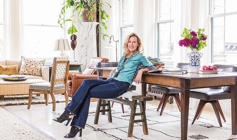
In September of last year, designer Katie Leede, whose interiors and textiles designs are known for their globetrotting beauty, was happily settled in SoHo on a charming cobblestone street. That’s when the news came that her building had been sold, and she needed to be out—fast. “My landlord calls and says, ‘Katie, you may need to pull over,’” she recalls with a laugh.
After a “mad search,” a lucky tip led to a light-filled, open-plan space right in the neighborhood. Arrangements were made, papers were signed, and Katie and her husband, Averill (the two were high-school sweethearts, reunited after many years), embarked on a whirlwind renovation. The goal? To play up the apartment’s wonderful sunlight and open layout while infusing it with Katie’s signature worldly, welcoming style. Patterns and colors from India, Japan, and Egypt—all major influences in Katie’s textile designs—figure prominently in the mix, cropping up on pillows, chair backs, and curtains and creating a well-collected warmth.
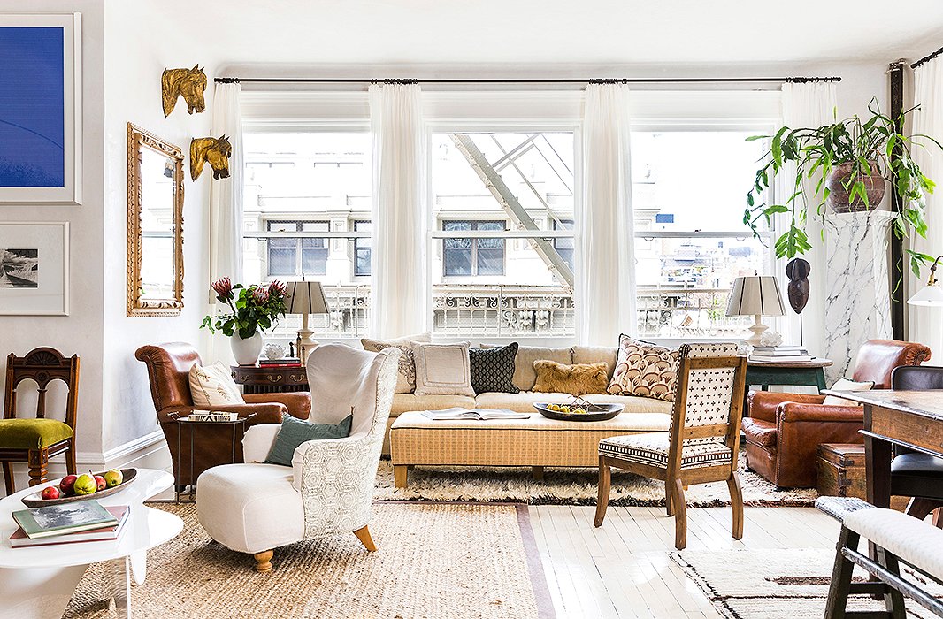
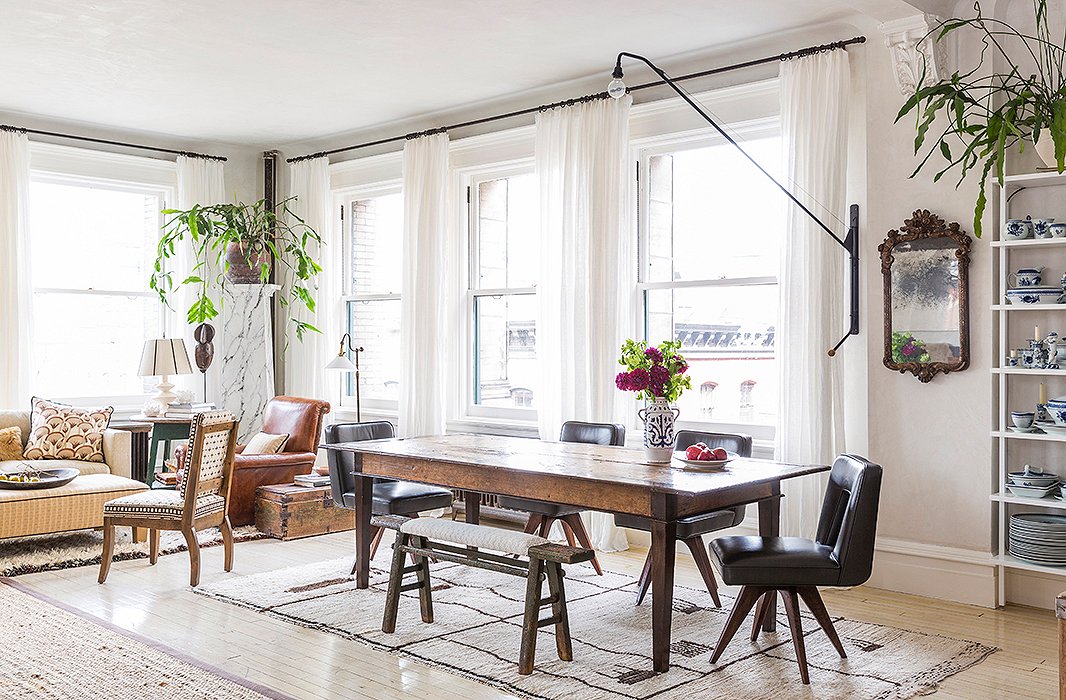
Livability was another top priority. Katie’s two college-age kids and Averill’s three make a lively clan, so the home had to be hardworking as well as beautiful. Open, multiuse spaces fit the bill: The expansive great room that forms the heart of the home encompasses three sitting areas, a dining space, and the kitchen. There are seats for dozens, comfy spots to put your feet up, and chic nooks to enjoy cocktails and conversation.
There’s also a rich depth of family history—made all the more incredible by the fact that Katie has spent just 10 months in the space. Beloved heirlooms, collected artwork, and pieces picked up on travels find homes in every room. What’s more, they’re actually used and enjoyed. “I guess that’s a big theme of my life,” Katie says. “Not throwing out the old but trying to rearrange it so that it feels fresh and usable and practical.”
From the gallery wall of family photos to the layered bed linens from India, this is a home that truly reflects its occupants. “It does feel very lived in,” Katie says. “And it is. We love it, and we’re so happy here.”
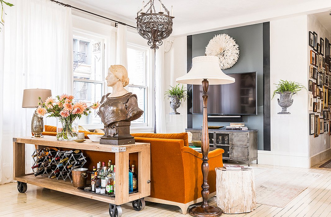
A favorite of the kids, this “supercasual” seating nook is ideal for curling up to Netflix marathons and Sunday football games. To downplay the TV, Katie turned to one of her favorite decorating tricks: a glossy stripe of black paint. Plexiglas pedestals bookend the setup, and a bust of Joan of Arc (“the first antique I ever bought”) keeps watch over the dining area.
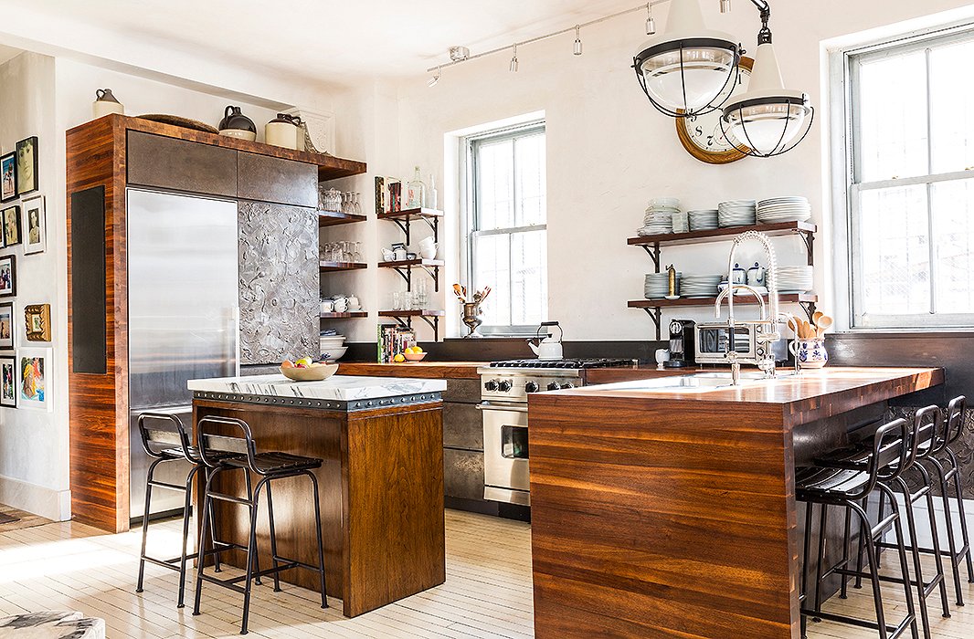
A big believer in wabi sabi, the Japanese concept of beauty in imperfection, Katie opted to leave the well-worn painted floor untouched. A plaster finish on the drawer fronts mimics the look of aged bronze, while industrial-style barstools provide extra seating. “There’s a really great flow,” Katie says. “We can accommodate a ton of people in that one large space… It’s very relaxed and easygoing, and we like it that way.”
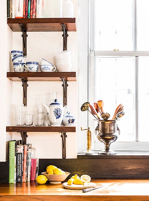
Open shelving provides space for pieces in constant rotation. Katie describes her entertaining style as “low-key but comfortable.” Whether she’s serving a spread of ready-made cheese platters or a home-cooked risotto, the vibe is casual: Guests pitch in with prep, and parties spread throughout the space.
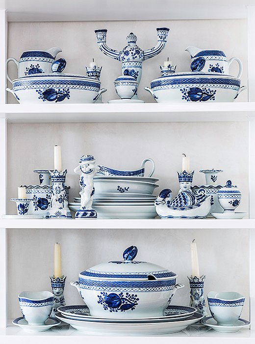
Katie’s treasured collection of Royal Copenhagen china was passed down by her mother, a consummate host. “She really would set a dramatic table,” Katie says. “I don’t really have time to do that, but even if it’s lemons thrown in with the blue-and-white china or special napkins, I do try to make everybody feel like an effort was made on their behalf.”
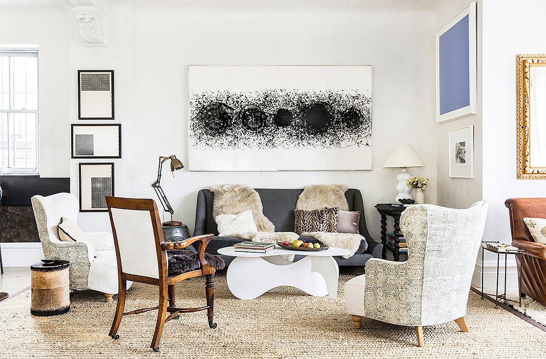
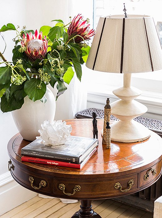
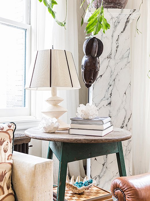
To the right of the kitchen, this seating area is the go-to spot for predinner cocktails. It’s also home to some of Katie’s favorite artworks, most of which have been collected or gifted over decades. A monochromatic palette pulls together a diverse mix of furniture styles.
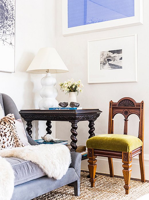
Touches of color—a dreamy blue painting, a green velvet chair—enliven the great room, which is grounded in neutral hues and layers of inviting texture.
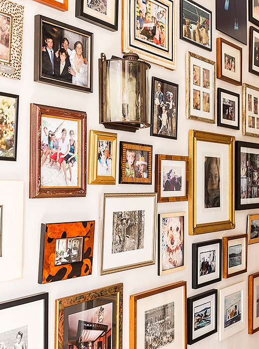
Family photos lead the way to the bedrooms. “That is something I try to do in every job,” Katie says. “You can’t hold on to the past, but it’s really wonderful to have your memory jogged. When you document these moments in your life and how they begin to stack up over time, it’s incredible how meaningful that is.”
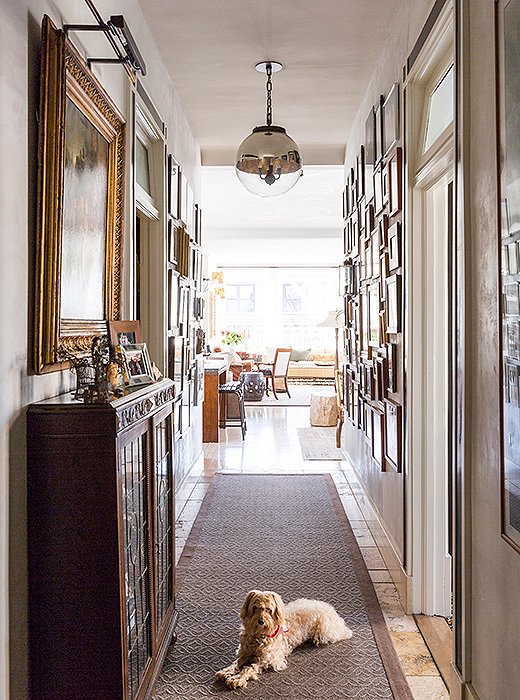
An antique Dutch oil painting from Katie’s childhood home rounds out the hallway, a magnet for guests and visitors (and the family pooch, Noodles). “People love hanging out there—it’s like a little magic zone. It’s a trip down memory lane in the best possible way.”
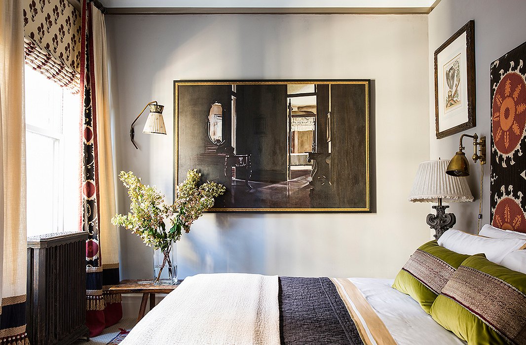
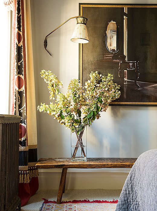
The master bedroom showcases another of Katie’s treasured art finds, an oversize still life bought in the 1980s at a gallery just a few blocks from her current home. “Who would have thought?” says Katie of the full-circle story. “I have to pinch myself because it feels kind of meant to be.”
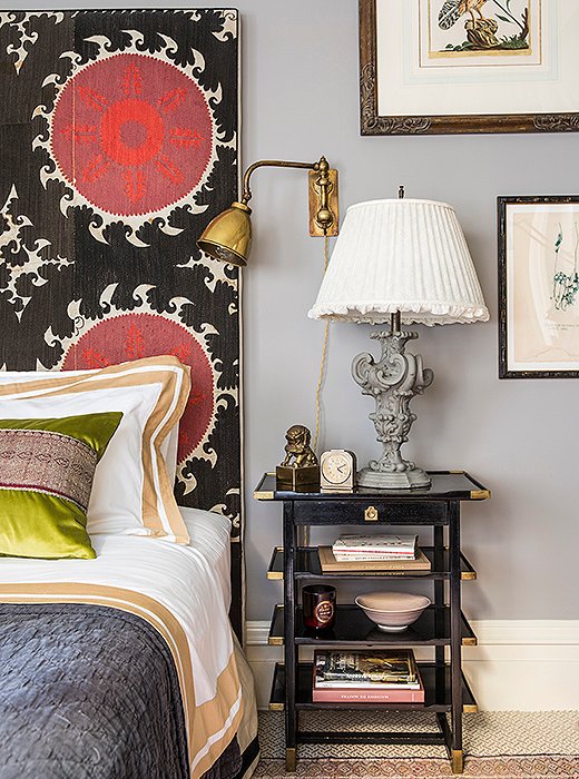
Unafraid of going big with pattern in a small space, Katie covered her headboard in a large-scale suzani print. “I find that by giving more definition to spaces through color and pattern you can make something feel a lot bigger than it actually is.”
The curtain border comes from the same vintage textile used on the headboard. “It’s a fun way to make use of every scrap that you can when you’re cutting up those old textiles,” Katie says.
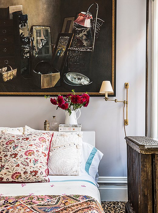
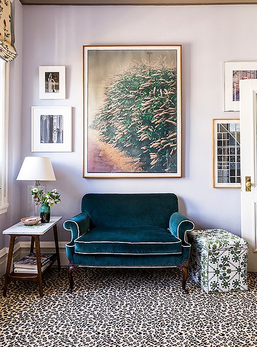
Katie chose Farrow & Ball’s Calluna, “a glorious lilac,” for this bedroom’s walls. “I call it the twilight-hour color. Color works really well to create mood and a sense of place, and that’s why I chose to make these bedrooms sort of cozy with color.”
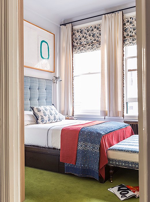
In the third bedroom, a printed ottoman and throw pillow from Katie’s collection for One Kings Lane complement curtain fabric from her first textiles collection. The papyrus-leaf pattern takes cues from ancient Egyptian wall paintings.
via: onekingslane