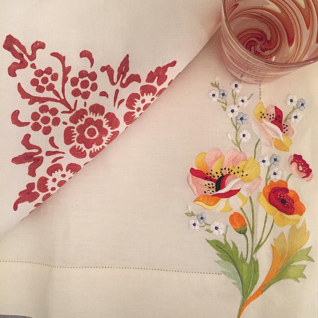
Happy, cherry, home sweet home lovely today, enjoy.
via::sabonhomeb
William Lenio: Journey Series, #616, 2016
Becky Owens

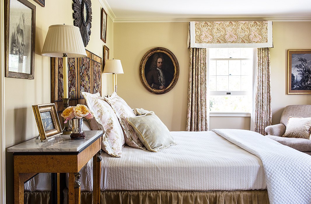
Photo by Nicole LaMotte
Designer Timothy Corrigan was looking for a color that would work well with the drapery fabric, a gorgeous paisley. The result is beige-painted walls that coordinate perfectly with the palette of the fabric’s print. The hue also brings out the ornate details of the furnishings, art, and accents without competing for attention.
Timothy’s tip: “The drapery fabric is a sophisticated mingling of taupe and blush tints, and Carrington Beige provided enough of a contrast to let the fabric stand out while not being too dark for this guest bedroom.”
via:inspired

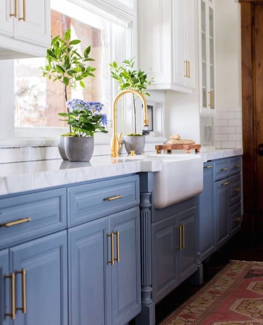
Kitchen by @reginasturrock
photography: @arnalphotography
via:bellisvintage
One Kings Lane
William Lenio: Journey Series, #600, 2016
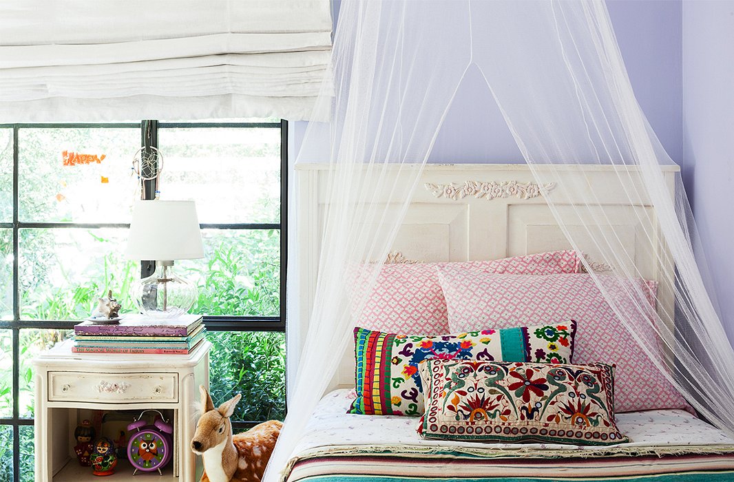
Photo by Nicole LaMotte
These lavender walls make the perfect foil for furnishings with a slightly grown-up feel. Lavishly embroidered pillows and a boldly striped duvet provide layers of spice atop antique white furniture, and the dream-inducing canopy of sheer netting is icing on the cake.
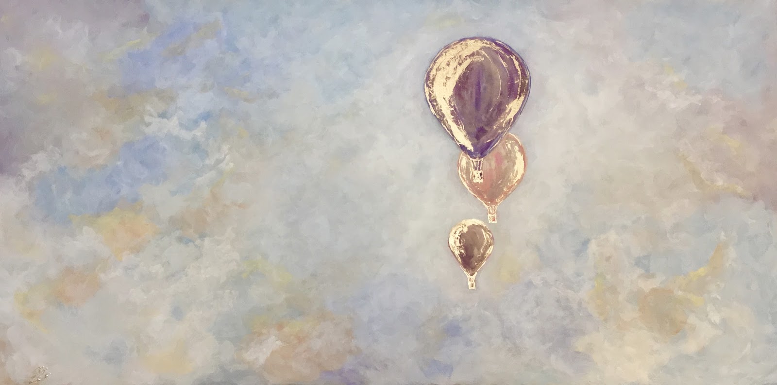
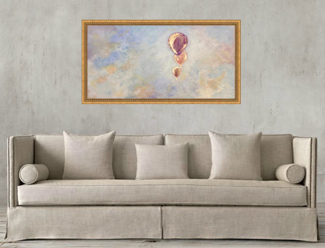
TITLE:
“UP, UP AND AWAY”
BY ZSAZSA BELLAGIO
MEDIUM:
OIL AND GOLD LEAF ON BOARD
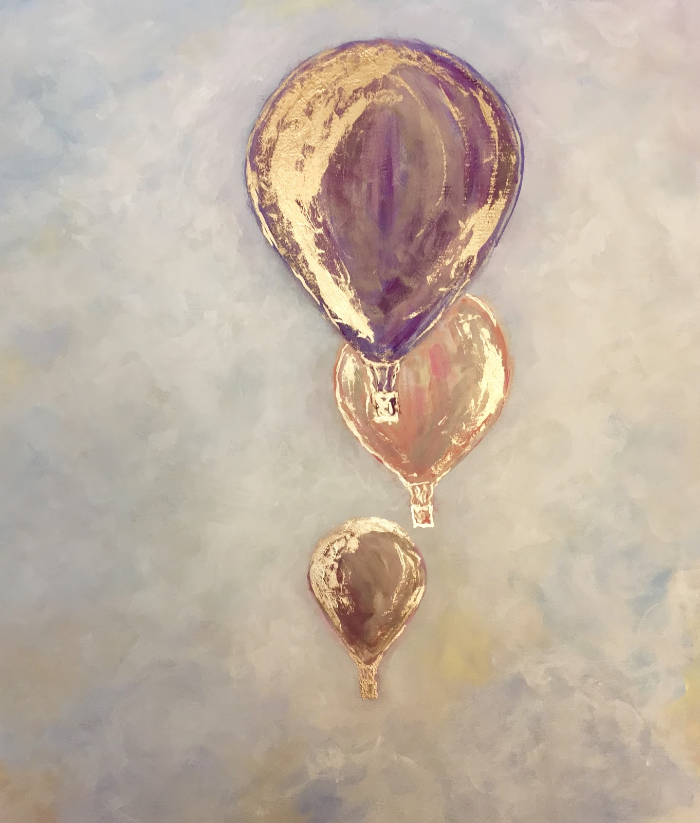
see details here: