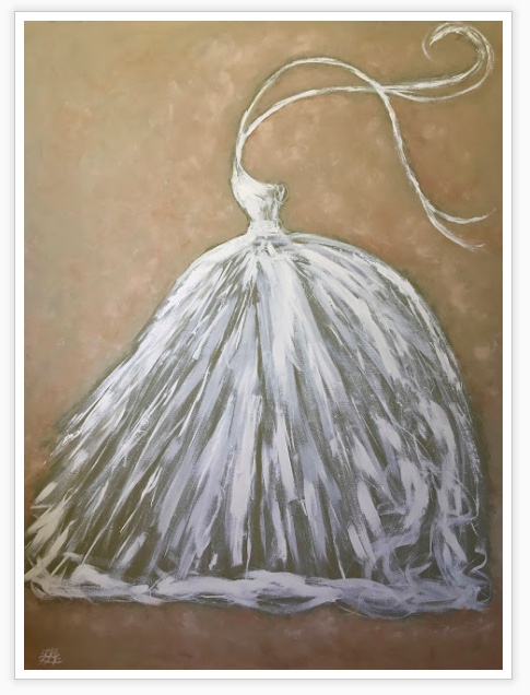
“BEIGE” anything but boring. Beautiful, soothing, elegant – classic.
Simply gorgeous home and art inspiration today – it’s all about BEIGE.
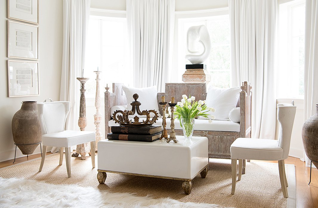
Designer: Tara Shaw
home
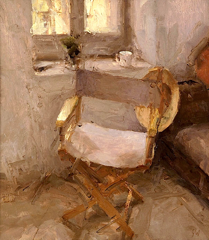
Jordan Wolfson Director’s Chair, 1998
“I sometimes use natural grass-cloth wallpaper, but a cheaper alternative that can give the same effect is a beige wall.”
— Amie Weitzman
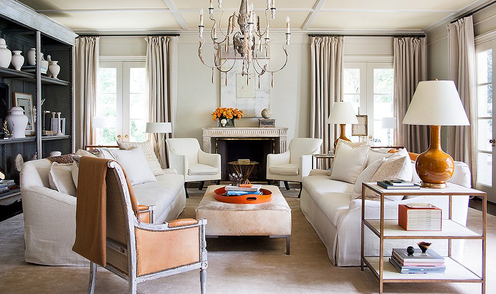
“I love to use neutral tones because they help create an architectural envelope.”
— Suzanne Kasler
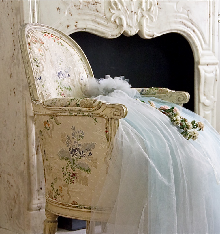
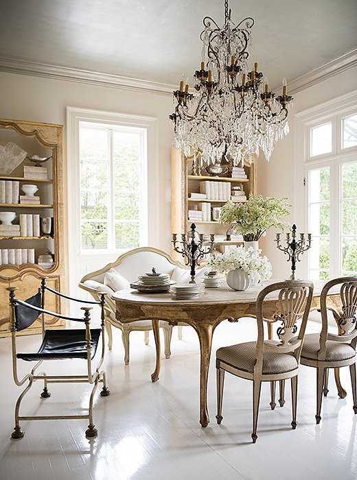
Designer: Tara Shaw
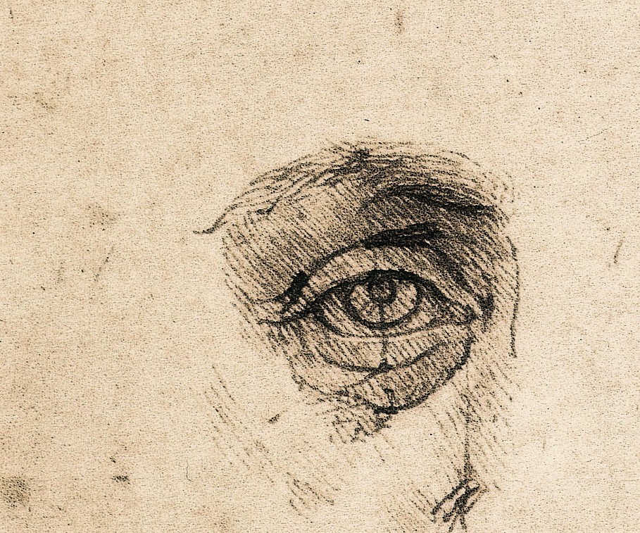
Leonardo da Vinci – Study of proportions (detail), ca. 1490.
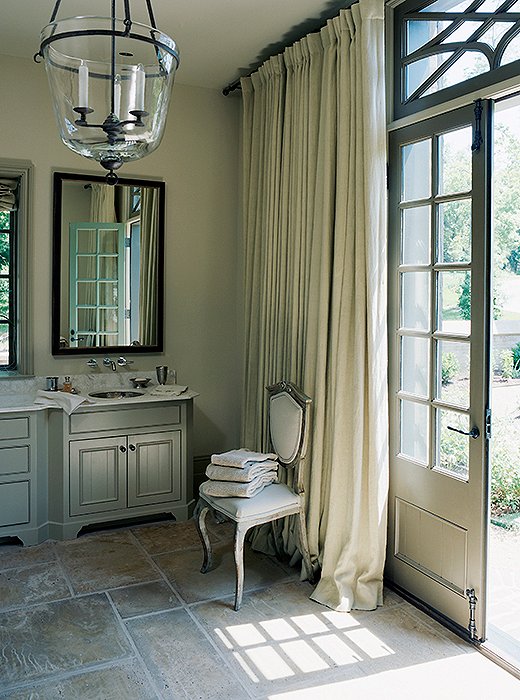
Photo by Don Freeman
“This was the perfect shade of neutral to highlight the natural tones of the stone used in the master bath.”
— Susan Ferrier
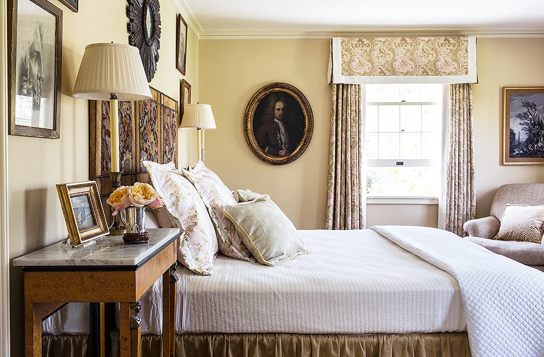
Photo by Nicole LaMotte
“This shade of beige is the perfect neutral color. It’s light and warm without being too pink or yellow, like many beiges tend to be.”
— Timothy Corrigan
see more details here:
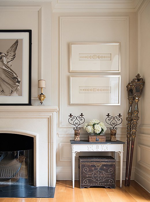
Designer: Tara Shaw
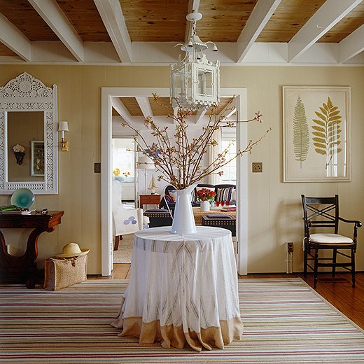
Photo by Simon Upton
“Beige is like a moderator of color.
The right tone of beige allows the eye to rest at peace.
It is also a great enhancer of most colors if used properly.”
— Jason Bell
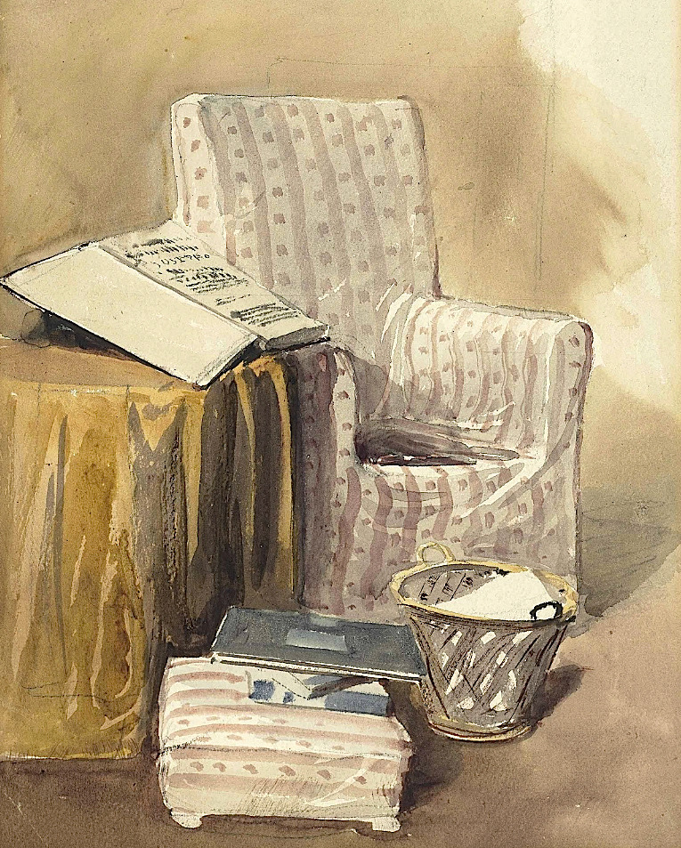
David Cox, Jun., A.R.W.S. (1809-1885)
Still-life of an armchair, wastepaper basket and open book
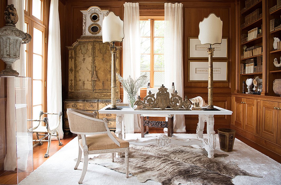
Designer: Tara Shaw
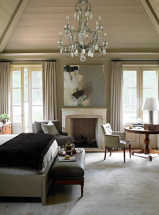
Photo by Miki
“Beige works with every style and every other color.
This shade helped create a peaceful atmosphere and plays well with the evening light.”
— Robert Brown
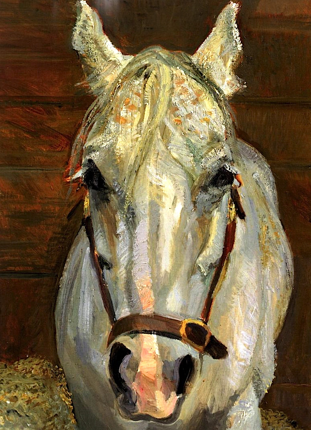
Grey Gelding
Lucian Freud – 2003
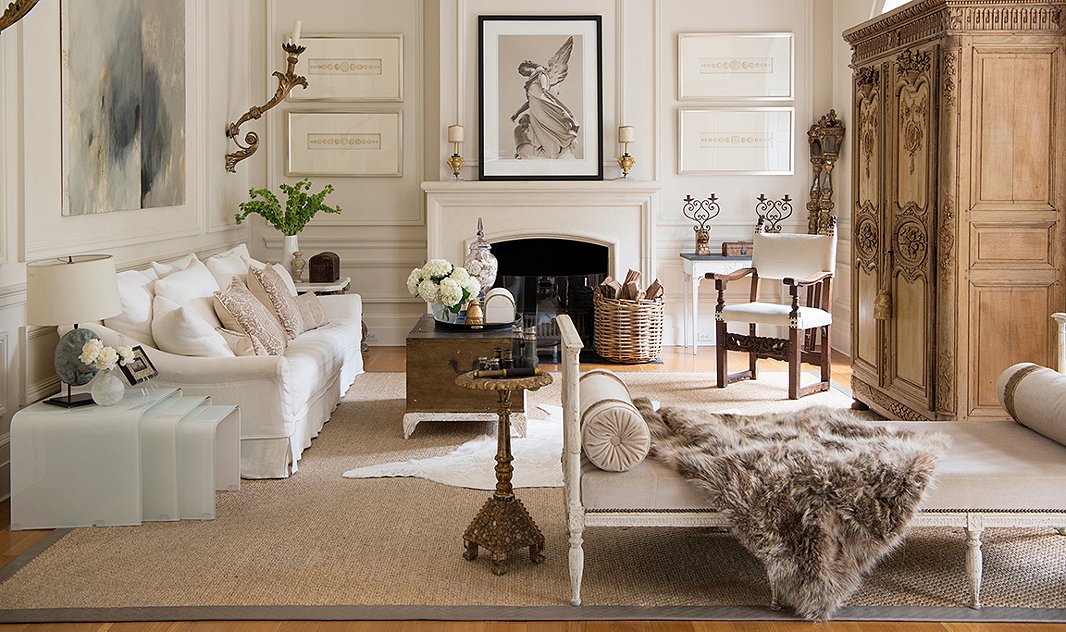
Designer: Tara Shaw
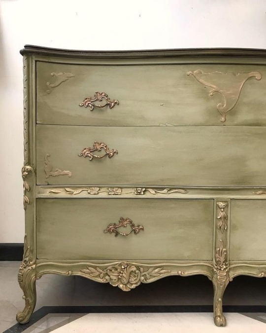
“A pitfall of beige can be choosing one that is too pale.
You have to get excited for the color of a latte, the color of paper bags, the color of cork.
Darker beiges have depth.”
— Chloe Warner
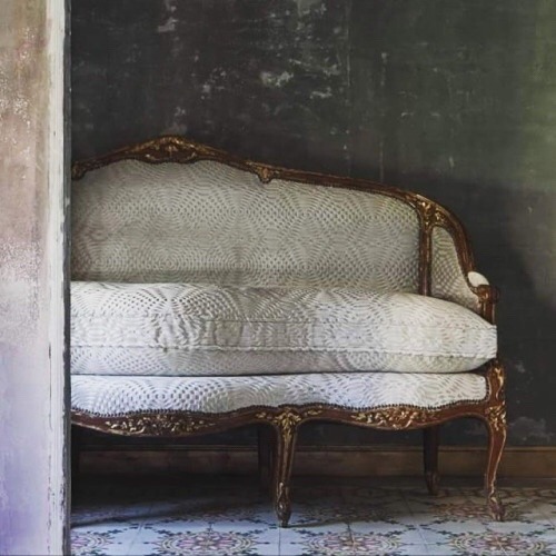
see more details here:
*
Visit:
